
Stringbean visual redesign
Overview
Stringbean was a building maintenance application I designed earlier in my career. As a personal project, I revisited the application to see how much I’ve grown as a designer. I focused on modernizing the visuals, enhancing usability, and applying everything I’ve learned about systems thinking and UI design over the years.
Problem, goals and final designs
The original Stringbean design solved core functional needs but lacked visual consistency and modern polish. Components were custom-built without a clear system, and the use of color and spacing sometimes made the interface feel cluttered and overwhelming. Hence, when I started this redesign project, I made sure that I clearly tackled these goals first:
-
Redesign the experience visually while keeping the core functionality intact.
-
Create a consistent, modern UI based on design system principles (HIGs and Material 3)
-
Practice and demonstrate growth in my design craft.


Design process
Over the years, I’ve learned the importance of establishing a strong foundation before diving into screens. For this project:
Design Guide First: I started by building a visual guide around the original company's logo, developing a clean color palette.
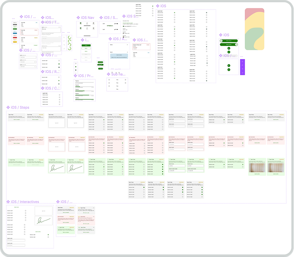
Components and Layouts: I created foundational layouts and reusable components to maintain consistency and speed up the design process.
Typography: I selected Open Sans for iOS and Roboto for Android to maximize legibility and native feel.
Consistency: Following a system-driven approach ensured the screens felt cohesive and intuitive.
Research
Since this was a personal project, no formal research was conducted.
However, I ran minor A/B tests to validate custom Floating Action Button (FAB) designs and made sure they fit the maintenance personnel workflows and to make sure they made sense to users of all tech levels. The persona remained the same: building maintenance staff responsible for executing scheduled and on-demand work orders.
Visual flow
In the original Stringbean project, I mainly relied on written specifications to communicate interactions and requirements. This took alot of time typing up and visually laying out all pixel measurements and more.
Over the years, I’ve learned that visual communication is often much more effective, especially when working with cross-departmental partners like engineers and product managers. For this redesign, I created visual flow diagrams that map out user actions, button behaviors, transitions, and animations. These flows make it easy for partners to quickly understand the logic and expected outcomes without sifting through dense documentation. Clearer alignment at the handoff stage reduces development time, prevents misunderstandings, and helps maintain the design intent throughout the build process.


Responsiveness
Great design shouldn’t break when you switch devices or modes. I built five core screens and adapted them for iOS (light and dark mode), Android, and a tablet view. Each version follows platform-specific patterns while keeping the brand feel consistent. Designing across platforms helped me think through responsiveness, accessibility, and flexibility early on, not as an afterthought.


iOS mobile, Android, iOS tablet
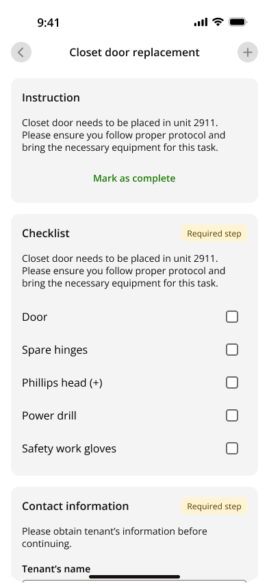
Task workspace 1


iOS mobile light, dark, Android
Task workspace 2


iOS mobile light, dark, Android
Landing / Task List


iOS mobile light, dark, Android
Sort & Filter bottom sheet


iOS mobile light, dark, Android
Task general information
Reflection
Looking back, it’s incredible to see how much I’ve grown as a designer.
Visual Balance: I learned that too much color can create cognitive overload. A well-spaced, breathable layout makes the experience far more pleasant.
System Thinking: In the past, I focused mainly on screen-by-screen design. Now, I think about systems first — building reusable components and guidelines that scale across products.
Continuous Growth: This project reminded me that growth is a journey, and there’s always more to learn and refine.